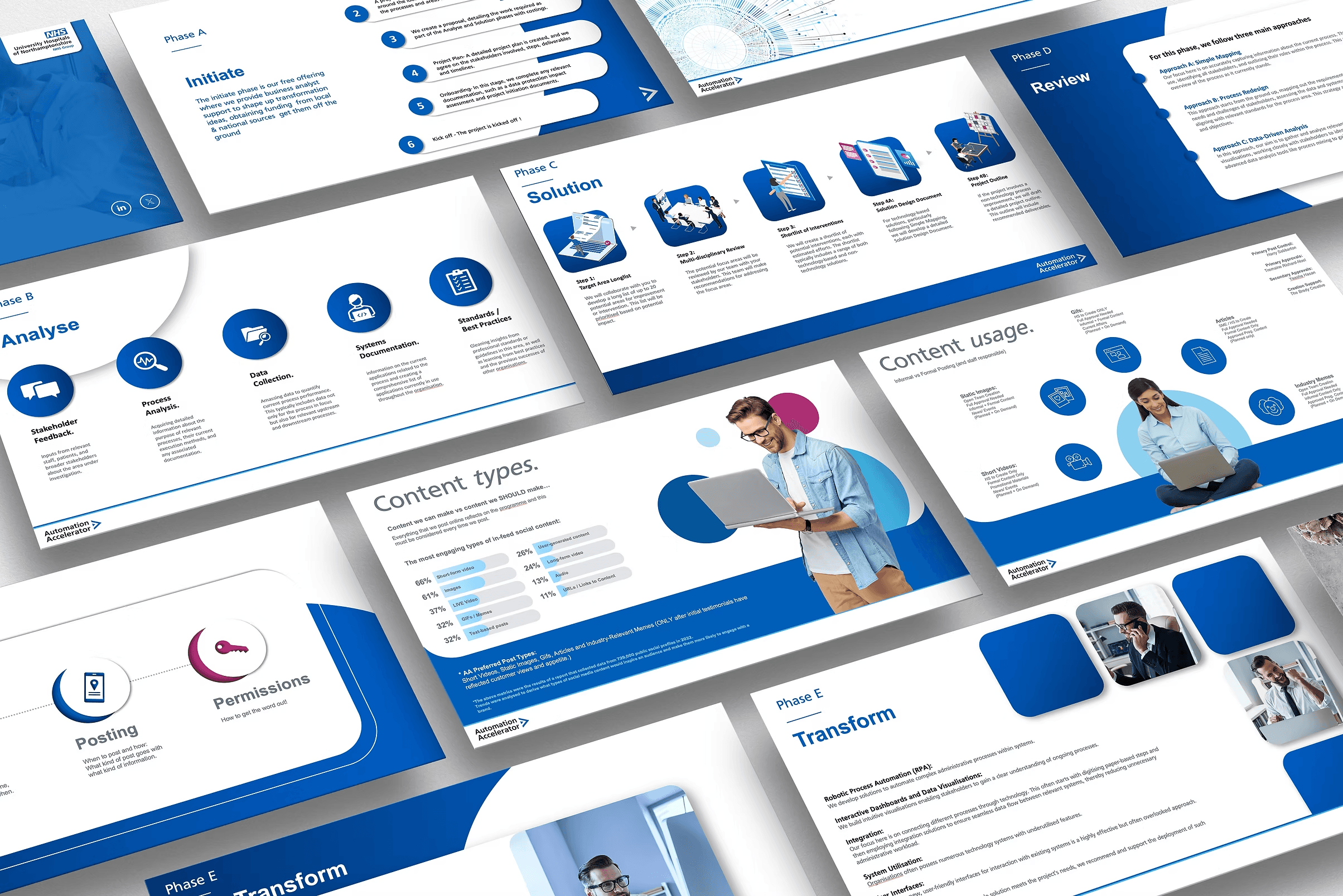
Corporate Presentation
Corporate Presentation
The NHS was deploying a brand new range of Automations through a nation-wide programme aimed at saving staff time and money, and even reducing the NHS waiting list. They needed a range of marketing assets to address public perception that automations were going to take jobs. The main way it was addressed was through pitch decks and presentations.
Year
2021 - 2024
Client
NSH Trusts
Service
Stakeholder Confidence
Location
UK
Context | Challenge | Constraints
Context: The NHS was rolling out a new range of automations through a nationwide programme, designed to save staff time, cut costs, and help bring down waiting lists. The rollout needed public and internal buy-in to succeed, and that meant tackling a difficult narrative head-on. Challenge: Automation is a loaded word in healthcare. Staff and the public heard "automation" and thought "job losses," and that perception had to be addressed before the programme could gain any real traction. The solution came through pitch decks and presentations, built to travel nationwide and win over sceptical audiences one trust at a time. My team ran dozens of meetings with NHS trusts, presenting the decks directly to delegates and leadership. The material had to do real work in the room, not just look polished, and it directly led to trusts investing in the programme. Constraints: Three-person team: copywriter, digital marketer, and me on design High volume of content, produced against strict deadlines Heavy pressure, given the scale and visibility of a nationwide rollout Every asset had to reframe a negative public narrative into a positive one Design had to hold up in high-stakes rooms with real decision-makers
My Role
Started as the sole in-house Graphic Designer, responsible for building the brand and marketing output from scratch. After just over a year, I was promoted to Creative Lead, taking ownership of the marketing function. The role shifted from hands-on production to setting direction, prioritising output and overseeing the wider marketing effort for my remaining time on the programme.

Process
Decisions

Outcome | Reflection
Outcomes: The decks did exactly what they were built to do. Trust delegates and leaders came away convinced enough to invest, meeting after meeting and the wider buy-in across trusts helped push the programme forward at pace. One presentation went further still, it was strong enough to help secure a grant for the programme, reviewed and awarded by Rishi Sunak when he was Prime Minister, a real validation that the work was landing at every level, from a ward manager in the room to central government. Reflection: Looking back, I'm proud of what this work achieved, it did its job under real pressure and helped move a genuinely difficult narrative in the right direction. If I'm honest with myself, some slides could have been tightened further, I'd normally push for less on a page. But this wasn't a normal corporate audience nervous about their jobs and taking away too much reassurance too early would have worked against us. That's a trade off I'd make again.

Tools + Deliverables
Tools: Illustrator, InDesign, Photoshop and Premier Pro. Deliverables: Presentation/ pitch decks Branded/ WCAG compliant website Marketing and exhibition assets